What it is:
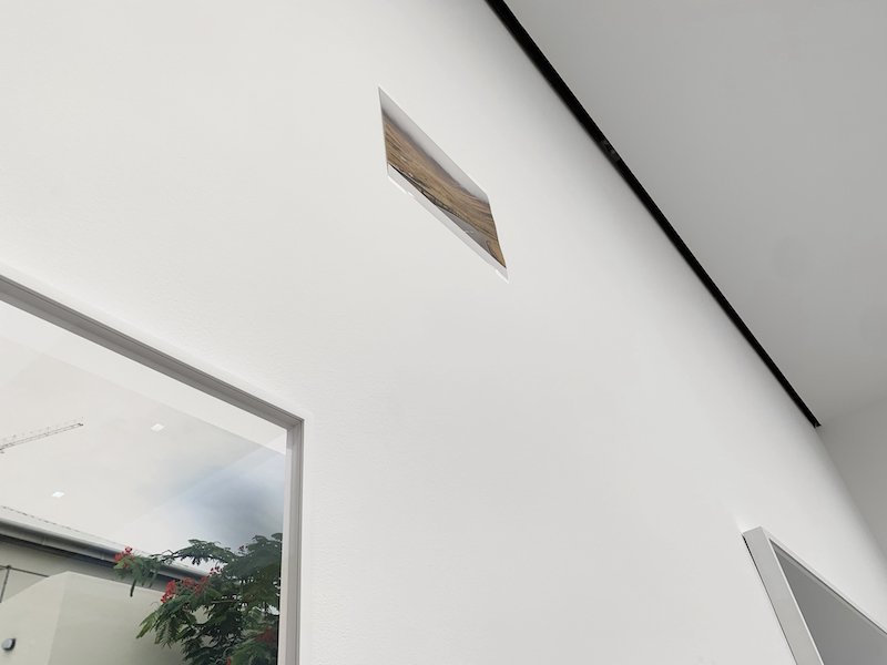
77 exceptional photographs by one of the most famous photographers in the world. And like all his exhibitions, Tillmans is OBSESSED with the space between those images. The walls are SO critical, that the artist spent over 2 weeks “living” in the gallery to decide on the exact size of each image (often testing many variants) experimenting with their exact placement and height on the walls, and even altering the architecture of the gallery itself. Everything matters - the exact sizes, groupings, location, wall color, and whether or not it’s framed. To see this exhibition is to consider the “object” of the photograph and the air in the room, as much as the images he captures.
Advanced viewing:
In every image, Tillmans leaves a section of the paper “blank”, - sometimes it’s an even border around the whole photograph, or (my favorite) when it’s a large chunk of one edge like in the above. He’s said that he always wants the viewer to remember that it’s a piece of paper. Consider both paper and image simultaneously usually has a pay off. For example in the image above, notice how the white "blank" on the bottom is echoed in the white line of the "wall" within the image, and that the white of the "wall" in the image is different than the white of the real wall in the gallery. The t-shirt plays with these connections and overlaps. know it sounds insane, but point is: in real life, there’s a quiet visual poetry that always expands beyond the image. So let your attention widen more than your usual experience with photography.
My favorite quote from the artist’s walk-through press presentation (thanks again for invite!) was in reference to one of the images above. He said: “The biggest images are not the most important - for example, the small portrait in the other room”. He then spoke about how powerful and important the content and images of a “postcard” is, even though it's so small. It's a great reminder that you should pay even MORE attention to the smallest images in the exhibition.
For example: Below are 2 “standard size” photographs (the kind you get from a 1-hour-photo place), tare images of the orange light in New York due to the Canadian wild-fire smoke. Fun fact: The lower image one looks up, the upper image looks down.
Tillmans also mentioned that BECAUSE he cares so much about the space between his images, he asks for all his exhibitions to be lit evenly, often to the confusion of museum technicians who have been so trained on how to spotlight artwork. The point is: every element of this exhibition asks you to consider the world between the photographs as much as the images themselves.
I mean, all this is just a huge bonus. He is ALSO my favorite photographer of all time before you even start talking about the walls and installation and lighting, so check the exhibition link below for great representations of the images themselves. He has a way of transforming the most mundane subjects into something worthy of sustained appreciation.
Wolfgang Tillmans @ David Zwirner Gallery, 525 & 533 W 19th St, ends 10/14 —>Exhibition Link


